
First Published - March 25, 2010
141 Bellingham Logo Design
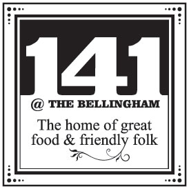 The Bellingham Hotel has long been a place to dine and be entertained in Wigan. When the hotel approached me to design a new logo for their soon-to-be-launched Bistro I took time to understand just what the new venture entailed.
The new bistro brought a more easygoing eating experience compared to the restaurant that had served many customers over the years, in addition, it provided diners with a greater sense of destination compared to the pub food served in the popular bar area.
Given the name had already been chosen the logo design is based on creating a traditional yet contemporary address sign. With the address numbers providing a heavy typographical element to the upper portion of the tile. The strapline “The home of great food and friendly folk” ensured the logo, without doubt, provided the viewer with clarity that this was a place to visit.