
First Published - May 30, 2012
Mobile Websites
 In a recent study results indicate that almost 50% of the UK population use the internet on a mobile device, rising to a whopping 71% in the 16-24 year old age group. If you have a website it’s essential that your site is at very least mobile ready.
Some websites ‘break’ on mobile devices – thankfully all WN6 websites work on mobile devices and almost all of the content dynamically scales to fit the screen. However as you can see with the chart on the right most of the mobile devices from a sample of 500 are actually mobile phones, mainly with  touch screens as input devices. So your website may look ok but how easy is it to navigate on a small screen?
The answer – most websites designed for larger screens aren’t that easy to use on the average size mobile phone, and with almost 50% of your audience using these devices it’s an essential part of making a website truly mobile accessible.
This analysis of mobile device data made it essential for WN6 to find an economical solution to the problem, one that ensured all the data from a website was easy to use on a mobile touch screen device. On our local news test site The Big Book we developed a small economical solution to the problem that ensures a site with many thousands of local news reports is easily accessible on any mobile web browser.
The solution implemented on The Big Book is effective and efficient, the website ‘looks’ at the device first before delivering the page, if it recognises one of the many popular mobile operating systems it delivers the mobile optimised view, with an option to flick to the desktop version if the reader wishes.
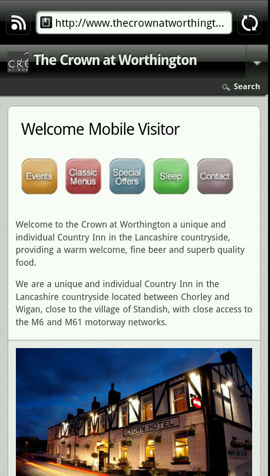
This solution provides the perfect way to deliver a website to a mobile device. In the future the mobile optimised website can be developed into ‘a mobile app’ drawing on the same database the website uses – but for now a mobile web optimised version works well.
A customer who recently took the advantage of this new low cost solution to mobile website delivery is The Crown at Worthington a popular North West Pub. Their website was equipped with the mobile optimised website solution, a few other tweaks where made, and now they have the first stage of a mobile optimised site. Once sufficient data has become available to understand the actual mobile visitors The Crown at Standish receives, WN6 Creative Design will work up additional analysis to look into developing the mobile optimised website further.
If you would like to make sure your website is mobile optimised then contact us today.