
First Published - March 8, 2009
Mikash Logo Design
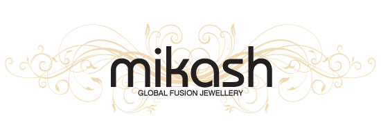 When approached by Mikash to create a brand new logo design for their company specialising in global fusion jewellery, I spent time understanding just what their brand offering was about.
In a nutshell, the company curates jewellery collections from all across the globe, interesting and often unique pieces rarely seen on the high street. With this in mind and with their eclectic range I felt it essential to embrace the myriad of network connections they have across the jewellery manufacturing market and reflect in the brand identity this very aspect of their business.
The name Mikash also interested me, I was told it was a fusion of the names of the founder’s two children Mike and Ashley, although common to fuse the names of children of loved ones to create a unique name the combination somehow this name had a distinct ring to it that I felt eluded to a more designer brand identity rather than a more regular jewellery outlet. The combination of all these elements lead me to create the logo design shown here.
The swirls and tendrils evoke the network whilst the typography works to evoke a designer brand one that could one day if needed be a name attached to an entire bespoke range of items.
Given the design was to be used online, in print and on packaging the look ensures that no matter how the design is used it looks unique and provides a great presence. When used on black jewellery boxes and reversed out the network of tendrils are picked out in gold to provide a stunning and shining presentation box.