First Published - February 16, 2012
Max Rep Sports Nutrition Logo Design
 Sports nutrition isn’t anything new but lately, it’s become big business. A local Wigan bodybuilder looking for an alternative to off-the-shelf sports nutrition products approached me to design a logo for his new business Max Rep.
The design brief stipulated the finished logo needed to be flexible to cover both male and female channels whilst strong enough to appear on an array of products and merchandise.
Having been an athlete and rugby league player in the past I understood the value of strong images and had some understanding of sports supplements. I immediately turned my attention to anatomy to gain inspiration, obviously building and developing muscles is key to the success of any athlete no matter what the sport.
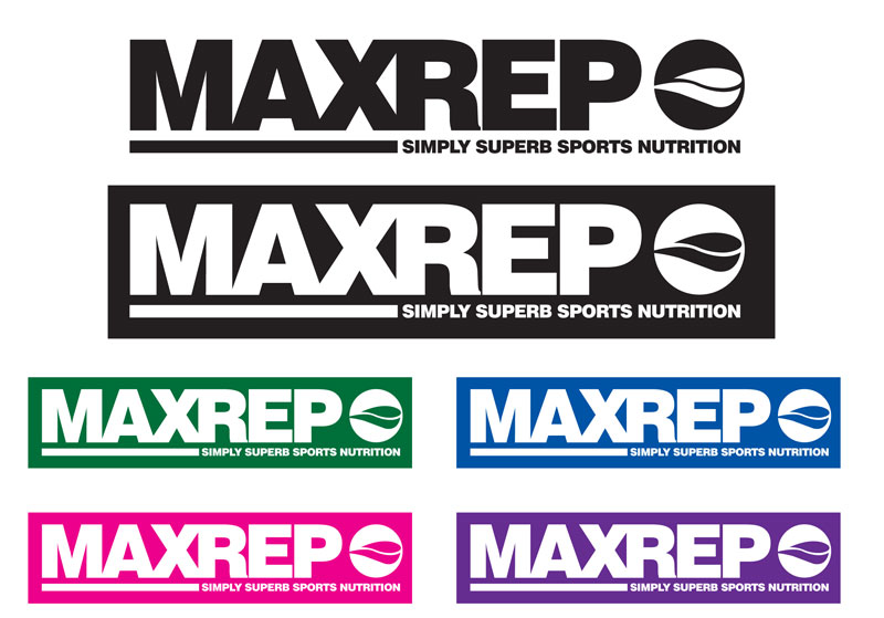
This logo design owes its icon element to the bicep muscle, the almost wave-like stylised design in the red circle draws references from the way the long and short heads of the bicep muscle appears in the arm.
The rooted solid nature of the typography further strengthens the look of the design, bringing with I feel a sense of a popular soft drink (Pepsi).
Overall the logo design works well in all colours as a mono design whilst being strong in its two-colour form.