
First Published - November 2, 2010
Complete Plumbing Solutions
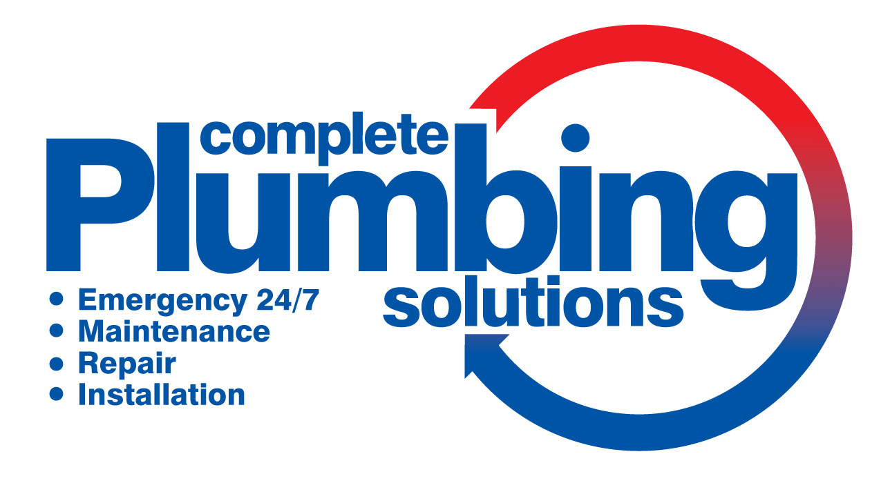 Sometimes a client asks for additional elements such as services added to their logo design, often this is necessary to provide a coherent message on work vans etc. Although including additional text on logos is something that the purest logo designer would ‘poo poo’ often on the ‘coalface of design’ it’s essential to follow the client’s lead to develop a solution that works on as many levels as possible.
This logo design for Complete Plumbing Solutions majors heavily on text elements not only in the name but in the four bullet points required by the client.
Given the heavy emphasis on text elements, creating an elaborate or too dominate icon for the logo would have been too much ensuring the two distinct elements would have ‘fought’ for dominance in the design.
The simple addition of a circular arrow running from red to blue depicting hot and cold water services provides enough of a graphical element to work with the text almost framing the message whilst providing visual impact.