
First Published - February 15, 2007
Astute Electrical Services Logo Design
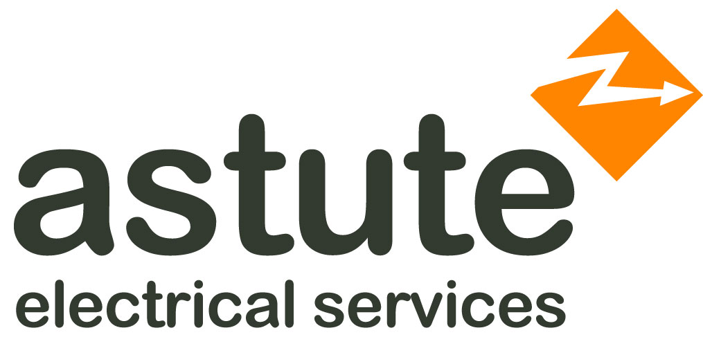 The definition of astute is having or showing an ability to accurately assess situations. At first, the word itself feels laser-like and pointed and perhaps it is, and in more ways than one the business in question needs to be laser-like as it provides electrical testing services to mainly business customers. However, the gentleman who provides the service is friendly and personable which needs also to come across in the logo design.
Given that the business provides testing of electrical equipment for safety and compliance there also needs to be an element in the offering that describes that Astute Electrical Services helps customers avoid dangerous faulty electrical items.
The resulting logo doesn’t use red for danger but orange which has similar associative qualities to red but feels less aggressive. The almost diamond shape and orange colour containing the electrical flash is used as a device to alert people of potential danger and is in many ways referencing American road signs used to alert drivers of up-and-coming hazards or changes up ahead.
To ‘warm’ up the design, I chose a sans serif font with a rounded feel to it, the rounded nature of the font ensures the name feels friendly, pointing to the friendly nature of the owner.