
First Published - March 22, 2011
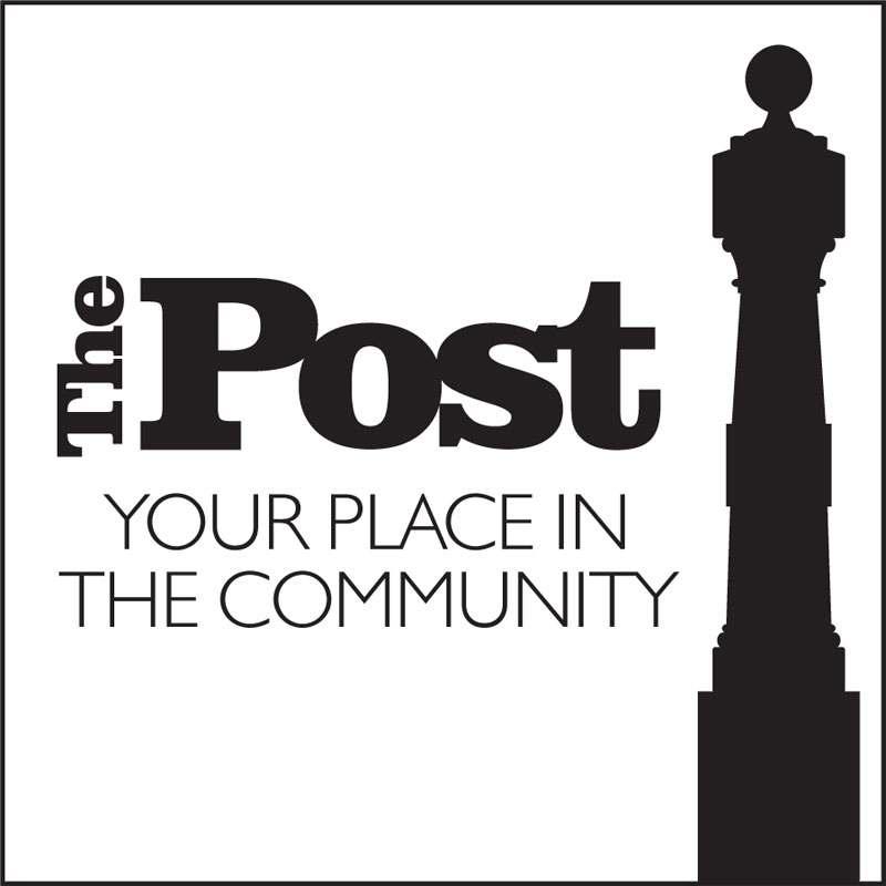
The Post Logo Design
 Orrell will always be a place close to my heart having spent a lot of time there at school and being the home of my father and grandparents it’s a place I really love.
When approached to design a logo for a new community hub in Orrell it was an obvious choice to choose the landmark ‘Orrell Post’ as a starting point.
Given the size and dimensions of the post, it would have been easy to use only an element however having taken a few pictures and created an illustration it soon became obvious that using it in its entirety was the only way.
The illustration almost acts as an exclamation mark within the design, a focal point and in many ways evokes the sense of a person standing and looking at the typography forming the name. Using a strong serif typeface the overall feel of the logo is solid and dependable whilst eye-catching from a distance.